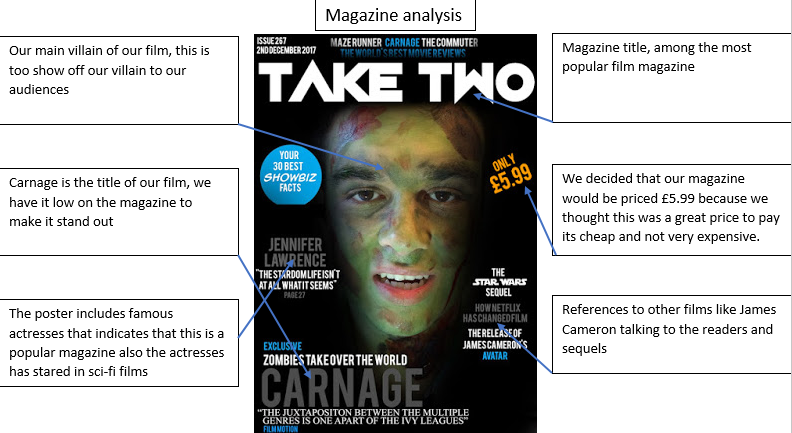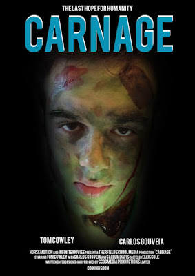
When designing the poster we kept it minimal, compared to other posters, but our poster provides a lot of enigmas that would confuse the general audience, but people who like to dissect what posters are trying to convey can have a simple understanding of what our film is about, the first clue that would give the audience an idea about our film is the character in the middle of the poster, we also have faded to black around the character this character is the villain of our film, but the audience wont know that yet but linking to a creepy and mystery vibe we used the colour black to give hints to our audience.
Near the bottom of the poster we have the hero and villains names placed, this gives us an idea who acting in our film and where the names are placed acts like they are the opposite, which is true since one is a hero and the other is the villain.