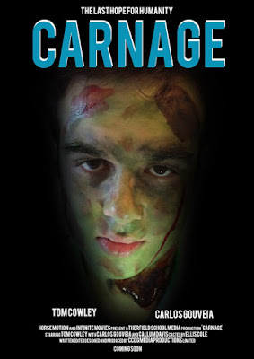
Poster


In our poster and magazine we needed to have big bold text this is because this shows the importance for our film trailer, our magazine and poster have been cut down to keep the story of our film trailer as minimal as possible, this is because if the audience wants to find out more they can go and purchase the film, we needed to give our audience some sort of idea on what our film is about, we did this by putting the villain as our main subject for our poster and magazine, we have the villain who is a zombie this could make our audience think why is the villain on the poster, magazine and not the hero and sidekick, this could make them think that there isn't a happy ending.
In our poster we have the main characters in our film trailer right under the villains face, they are also spreaded out which could make it look like they are the opposites which they are as Tom is the hero and Carlos (me) is the villain.
in the design for the magazine, we have included more information, this is because of how magazines include multiple different films and information compared to the poster where its only about our film and nothing else, while the magazine could have other films in it as well.


No comments:
Post a Comment