Representation have you subverted or conform to stereotypes typical of your genre?
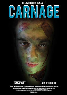
I think my group has conformed to the general stereotypes of horror and sci-fi, we think we have conformed to the stereotypes of sci-fi because we have used green screens and special effective that involve aliens, robotic alias, helicopter crashes and also a UFO attacking Earth, we also think we have conformed to the horror stereotypes this is because of the zombies that our in our film, we decided to go for zombies as it subverts the general stereotypes , we decided to use sci-fi and horror genres because these two genres usually go together, but since we are using zombies our villain it is a bit different compared to other film genres with horror and sci-fi together.

I am going to compare this scene from our film trailer and 28 weeks later running way from zombies scene, I decided to compare this two scenes because they are very similar but also different at the same time, in our film we have the main character and his side kick running away from the camera which makes us think the zombies (the villain of our film) is behind the camera
In 28 weeks later its similar to our film where they are running away from the zombies but the difference is, the camera is following the main character of the film which is effective because it puts the audience into the main characters shoes making it feel more realistic.
 To improve our film we could of made the camera follow the main characters to give it more action in our film.

I am going to compare this scene from our film trailer and 28 weeks later running way from zombies scene, I decided to compare this two scenes because they are very similar but also different at the same time, in our film we have the main character and his side kick running away from the camera which makes us think the zombies (the villain of our film) is behind the camera
In 28 weeks later its similar to our film where they are running away from the zombies but the difference is, the camera is following the main character of the film which is effective because it puts the audience into the main characters shoes making it feel more realistic.
 To improve our film we could of made the camera follow the main characters to give it more action in our film.
In this scene of our film we have a close up of the villain (Carlos) we tried to add as much detail as possible but we were limited to our budget for our film and didn't have enough products to make our film realistic as possible. I am going to use the walking dead season 1 to compare this is because they have close ups of zombies and they seem more realistic, this is probably because of the budget they received for the film production.


No comments:
Post a Comment