Media poster
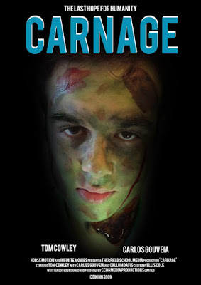
When deciding to create our poster we decided to have some similarities with the Avatar poster this is because the Avatar has a creepy and mysterious atmosphere we decided to take out the idea of having a face in the middle of the poster this is usually a position for an important character, we decided to use this position for the villain in our film, this is because this will get the audience to think why is the villain the only character on the poster and also brings up the idea that the film doesn't have a good ending. We decided to use face paint for our villain as it gave a more realistic feel to the character as it is seen as a more believable zombie, we also used photoshop to blacken the eyes to increase the creepy factor in the design of the poster.
The programs we used to create this media poster is photoshop and an Iphone, we used the Iphone to take the high quality picture of the villain then we cropped out unneeded areas which is when we used photoshop to shade out in black the bits we don't need, we also downloaded specific texts to make our poster a little but more unique compared to the other groups in our media class.


No comments:
Post a Comment