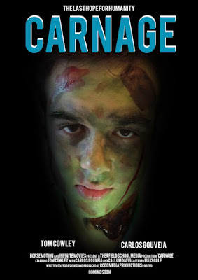
Media Poster Draft
Media Poster draft done in Photoshop
In designing our poster we are going to have the villein/ the zombie in the middle of the poster, this will make the face more clearer and stands out, we also added some effect on the eyes in which I made it glow red which adds a creepy factor to the poster, but it isn't complete as its missing the title and important information as it helps the audience understand what the film is about
Media Poster draft done in Real life
This poster is our ideal idea as it has the position for where we want the title and the villain is also going to be on the poster in the middle of the page, when we get the poster complete we plan on using Photoshop and a high quality camera to give our poster a unique feeling to it and also want it to stand out as much as possible.
In the final deign phase of creating our poster we might decide to change the positions of titles and add extra features to the poster as we are very inexperience in design poster.


No comments:
Post a Comment